How bad is it?
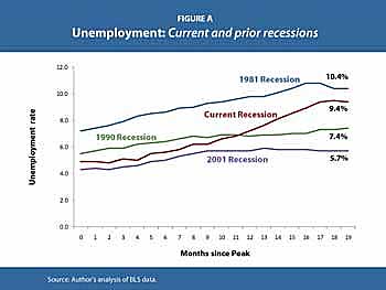
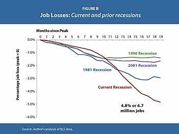
September 2, 2009Jon Brooks Comments OffThe Economic Policy Institute has posted some charts and analysis comparing the jobs deterioration in this recession and previous downturns. What did they come up with? Hint: It’s not pretty. These two charts are particularly telling:
 “Employment has decreased much more during this recession—4.8%—than in prior recessions. In particular, during the first nineteen months of the recession of 1981/1982, employment declined by only 2.9%”

“Employment loss during the first eight months of this recession was relatively mild compared to previous recessions but then it fell off a cliff and now far surpasses the employment loss of the early 1980s.” And of course, if you happen to be a data point on these graphs, it’s even worse than that…

